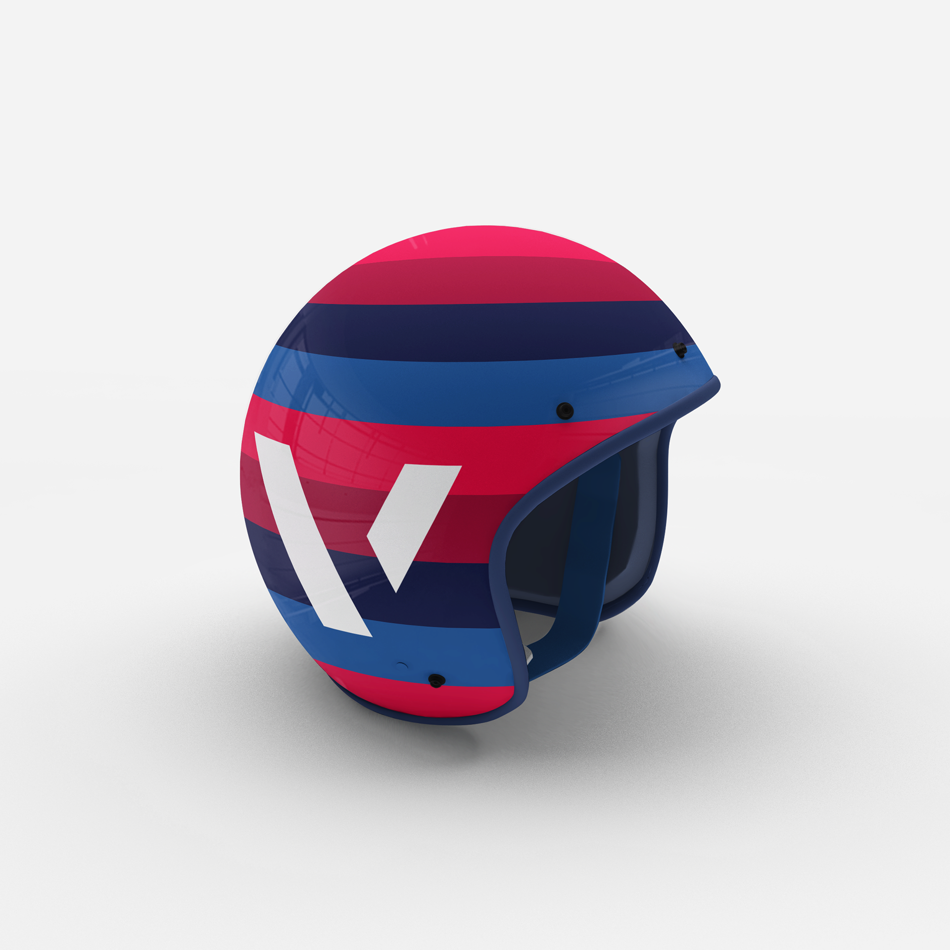
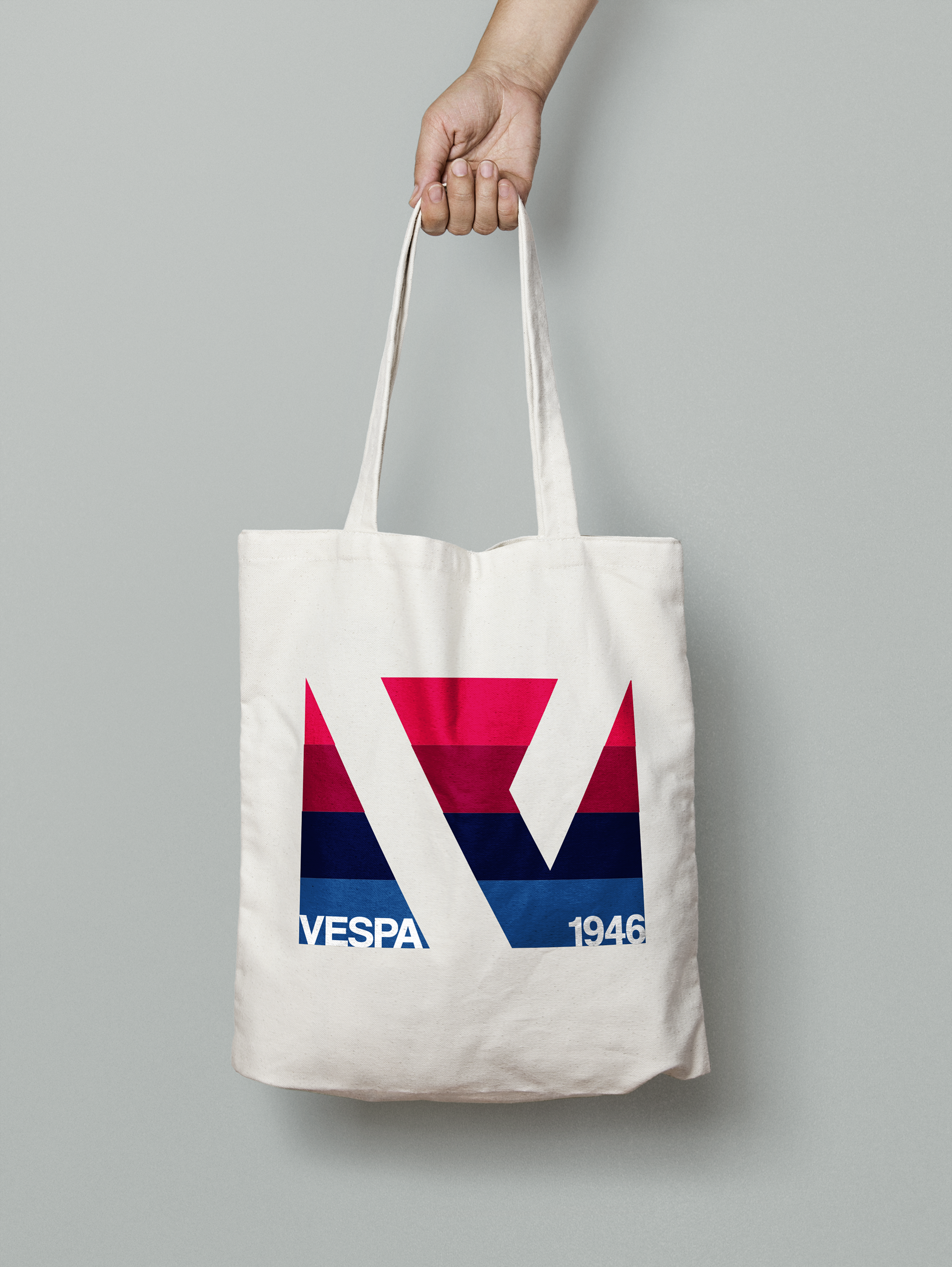
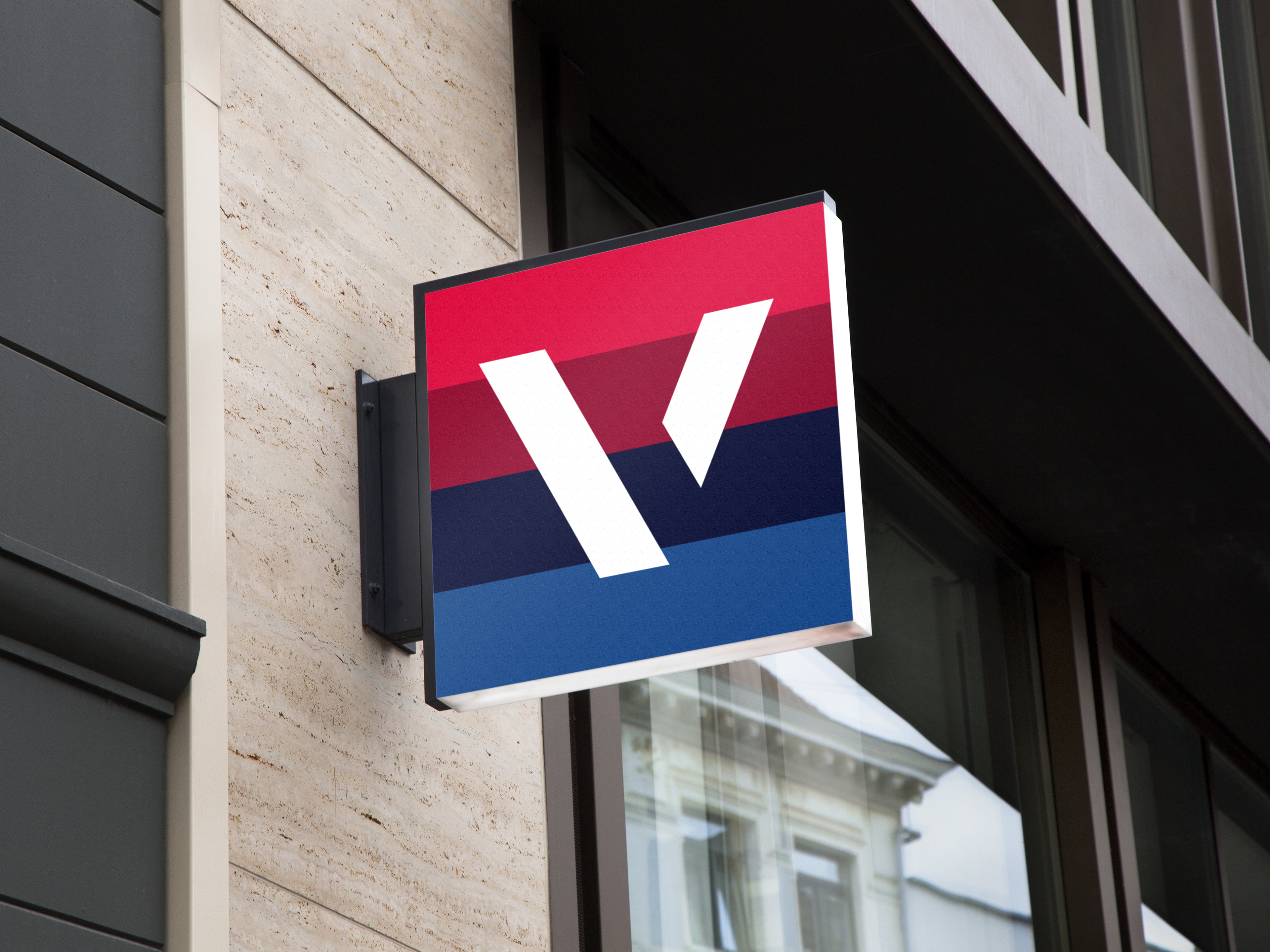
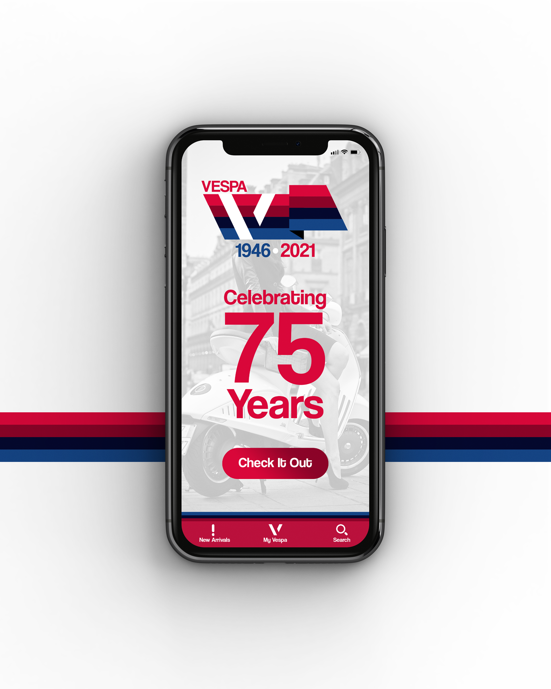
Tasked with re-designing the branding behind a large company, I decided upon Vespa. Known for their vibrant and efficient scooters, Vespa deserved a brand update to exemplify the quality of their vehicles. The original design was a curved and italicized word-mark which trendy for the time felt a tad outdated compared to the clean style of competitors.
The hope in this redesign was to make Vespa easier to remember both in the sense of a logo and what the brand was conveying: speed, style, and a pinch of luxury.
